
Backpack
Creating meaningful communication between teachers and parents
Timeline
8 Weeks
Role
UX Designer
Platform
iOS
Preview
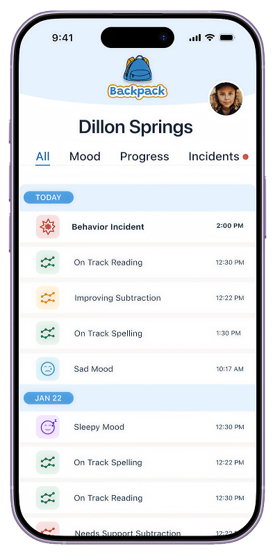
Backpack in action!
Parent Flow
The parent opens the child’s dashboard and sees new updates. After reviewing them, the parent decides to schedule a call with the teacher. A confirmation screen then shows that the call has been scheduled.
Teacher Flow
Teacher selects student, chooses new incident, fills out the form, and sends to the student’s parent.
Discover
Parents and teachers need to communicate without all the “fluff”
I designed an MVP for a lightweight parent-teacher communication tool that makes it possible to send a meaningful daily update in about 30 seconds.
The goal is not “more messaging.”
It’s a simple, structured snapshot that feels clear for parents and realistically doable for teachers.
Technical Info
Problem
Existing parent-teacher communication tools can be helpful, but they often rely on open-ended messaging or inconsistent updates. That can create confusion, defensiveness, or “I’m only hearing bad news.”
Goal
Create a simple, structured snapshot that feels clear for parents and realistically doable for teachers.
The competitive landscape
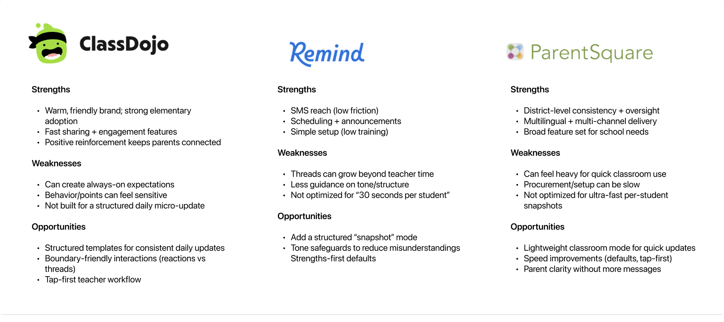
Competitors in ed-tech with parent-teacher communication platforms.
I asked questions like:
“What’s frustrating about communication with parents (even when everyone has good intentions)?”
“What takes the most time or creates the most back-and-forth?”
“What do you wish parents understood about your time and constraints?”
“When was the last time you got an update that felt genuinely helpful?”
“What helps you trust that the teacher sees your child fairly?”

“They only call you unless something crazy happens… otherwise I have no idea.”
Sydney, 29, mom of a 5-year-old.
Tools used
Figma
“More of the meat of it and less of the fluffy stuff.”
Cory, 37, dad of 9-year-old.
Getting to know the audience
I started by interviewing six people: two parents of elementary-aged children, three elementary school teachers, and one nanny.
“Every single day is… a whirlwind of like nonstop, nothing stops.”
Anne, 36, K-12 teacher.
Process
Discover, Define, Develop, Deliver
Define
Defining user needs
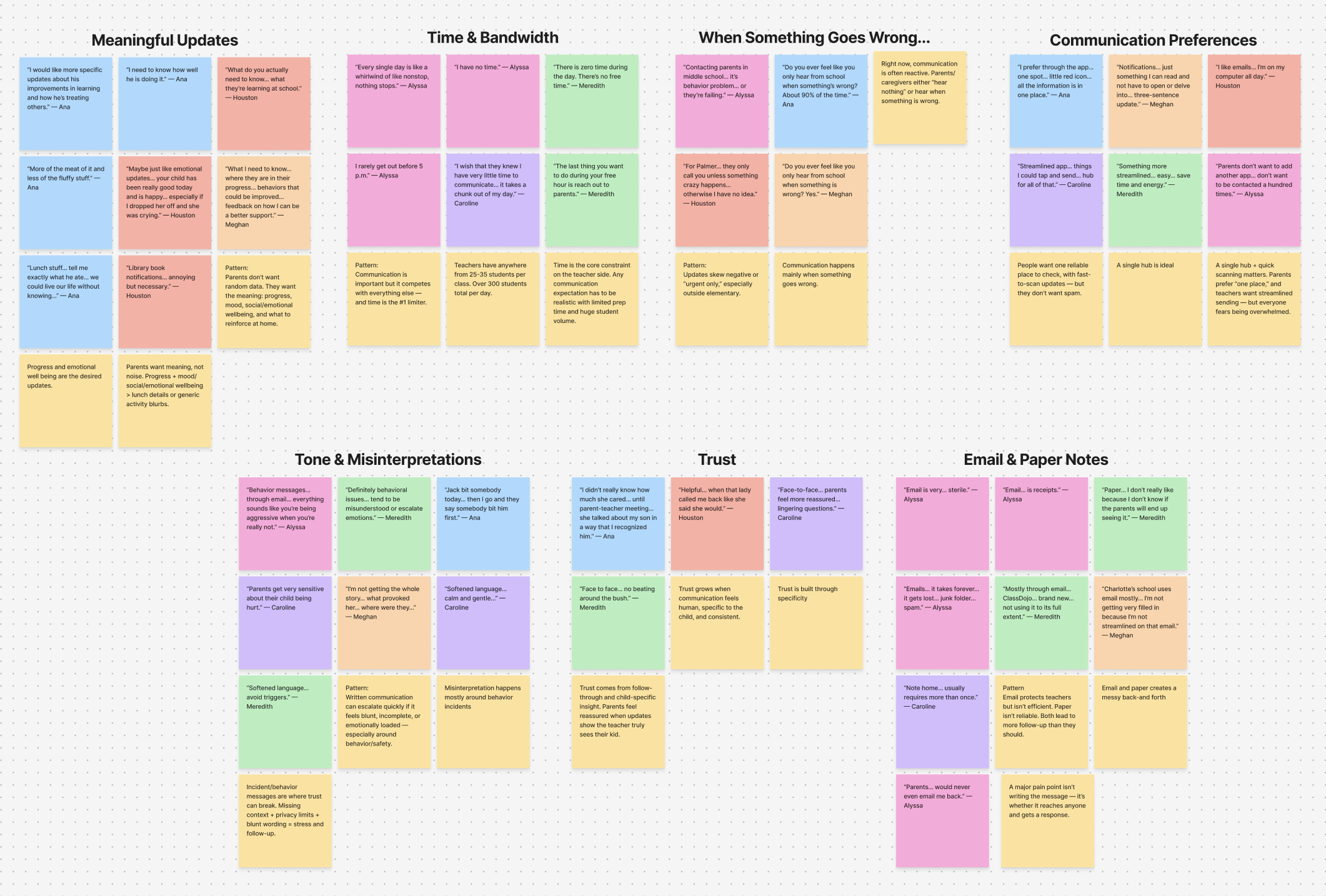
Affinity map.
Key Insights
Communication competes with everything else and time is the primary barrier for teachers.
Current communication methods create inefficient back-and-forth requiring multiple attempts.
Parents want progress updates and emotional wellbeing information over trivial details.
Parents want a single hub for all communication with quick-scan notifications.
Trust grows through child-specific insights and consistent follow-through.
Empathizing with the users and bringing them to life
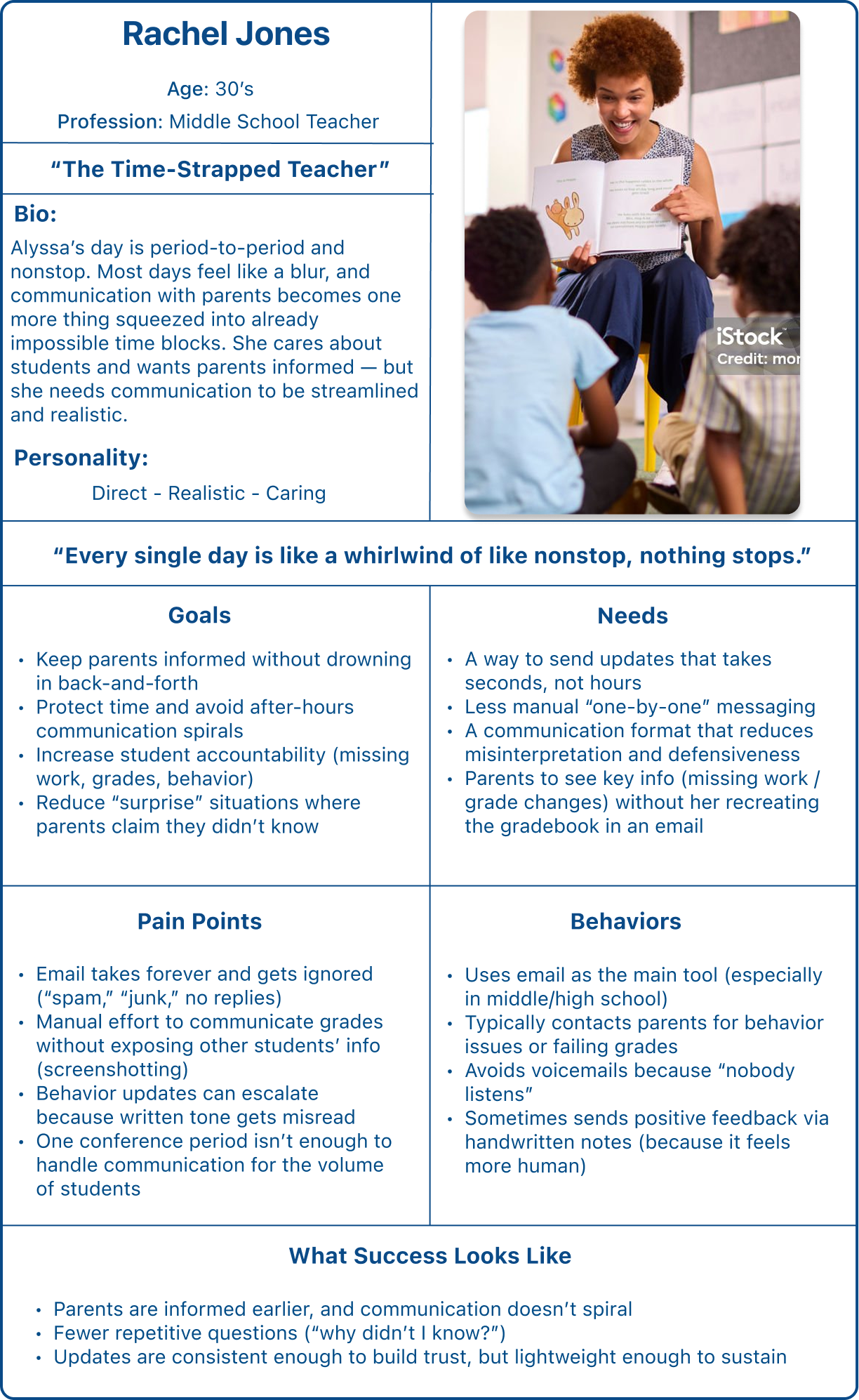
Persona 1, “The Time-Strapped Teacher”.
What’s the problem?
Problem Statement for Teachers
Time + Sustainability
Teachers struggle to communicate consistently with parents because their schedules are packed and they have limited time to write individual messages, which leads to communication happening only when issues become urgent (ex: behavior problems or failing grades) instead of regular, supportive updates.
Goals for both parents and teachers
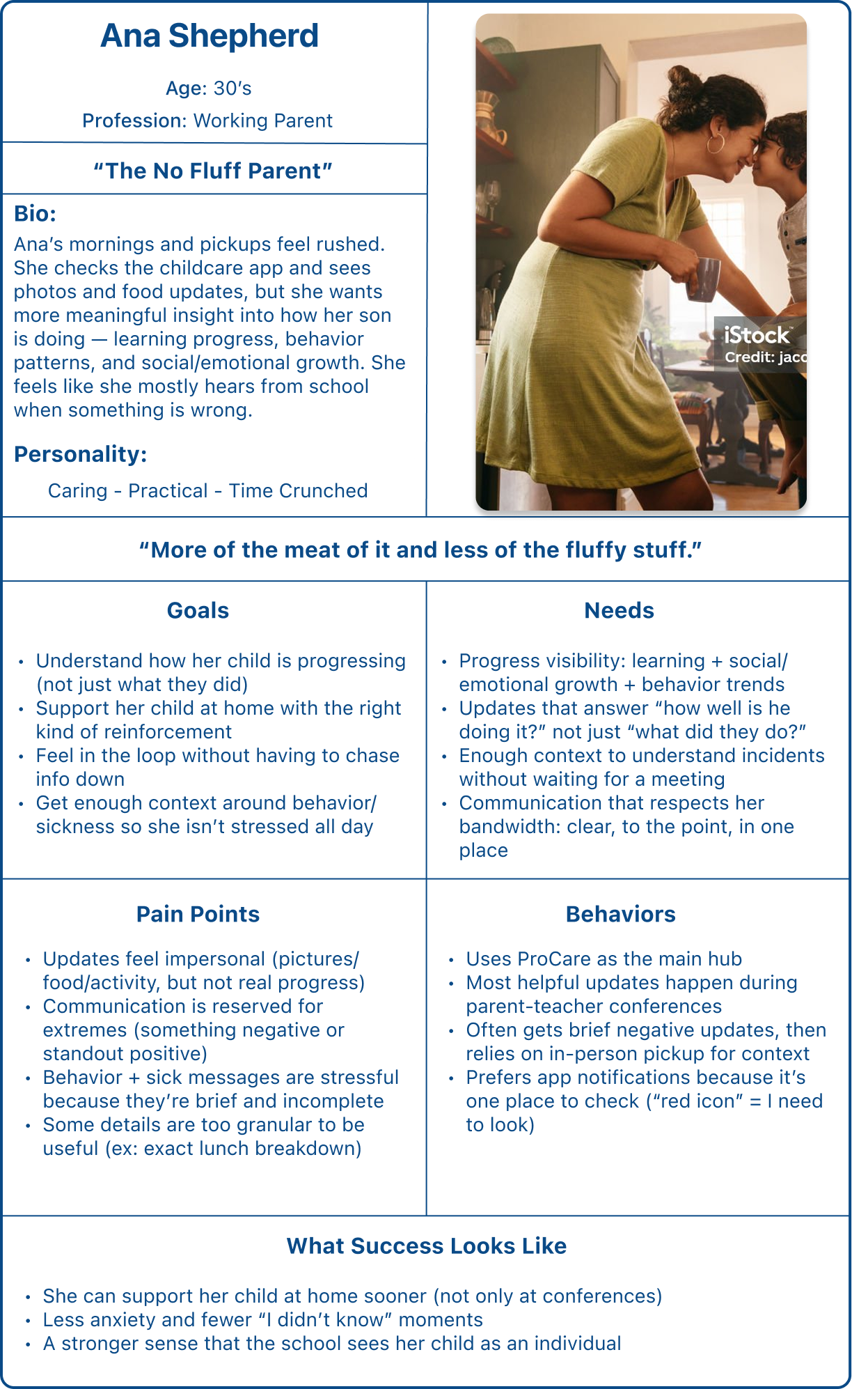
Persona 2, “The No-Fluff Parent”.
Problem Statement for Parents
Meaningful Updates
Parents struggle to understand how their child is really doing at school because updates are often generic or focused on surface-level details (photos/food/activity), which leads to parents feeling out of the loop about progress and social/emotional wellbeing until conferences or a problem occurs.
Clear communication that builds trust
Teachers want fewer misunderstandings; parents want reassurance and clarity; schools want fewer escalations.
Less back-and-forth
Parents want the full story sooner; teachers want fewer emails and calls; schools want fewer admin interruptions.
More meaningful info with less noise
Parents want progress and context, not just “fluff.” Teachers want to send something useful without it becoming extra work.
Earlier support = fewer surprises
Parents can help at home sooner, teachers don’t have to defend “I already emailed,” and students benefit from consistency.
Develop
Communication needs to be quick and meaningful for students to thrive
I began the develop phase by creating a feature set and site map. With time constraints and daily stress in mind, I focused on prioritizing efficiency and increased understanding between both parties.
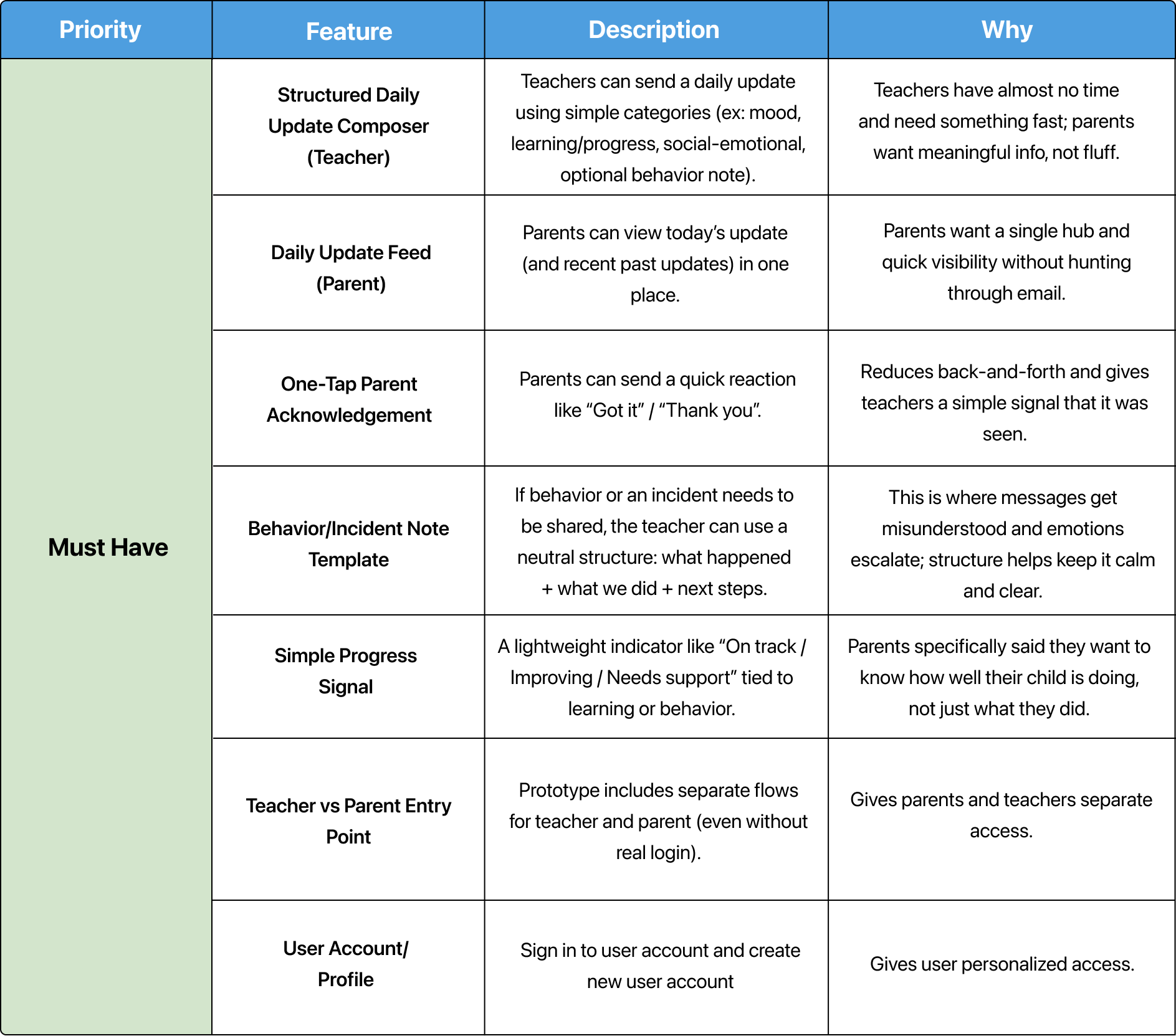
Feature set showing the “must have” priorities. Linked to full set in Figma.
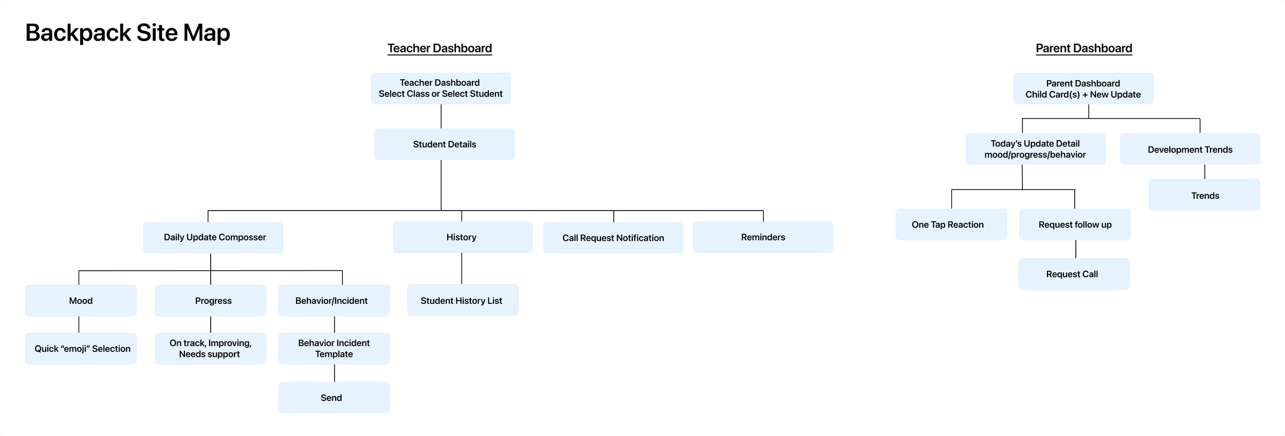
Site map showing parent and teacher dashboards.
Low-fidelity wireframes
When deciding which screens to design, I chose to focus on the incident report flow from both sides: the teacher creating the report and the parent receiving it. Incidents were one of the most mentioned topics during user interviews. I aimed to streamline this process, making it simpler and friendlier on both ends.
Low-fidelity wireframe sketches.
Low-fidelity usability testing and results
Visual direction for Backpack
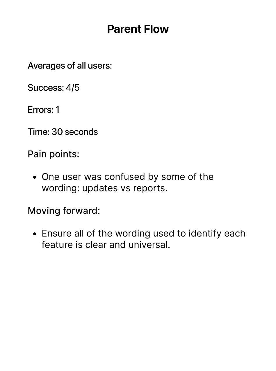
I tested five participants on low-fidelity wireframes using a Figma prototype. Participants were asked to complete two tasks:
Teacher flow: Find a student and send an incident report to the student’s parent.
Parent flow: You are a parent. Check your child’s progress, and if you see a new report, schedule a follow-up call with their teacher.
* It’s important to note that I no longer have the low-fidelity wireframes because I iterated on them all the way to the final product. That was a habit I later corrected.
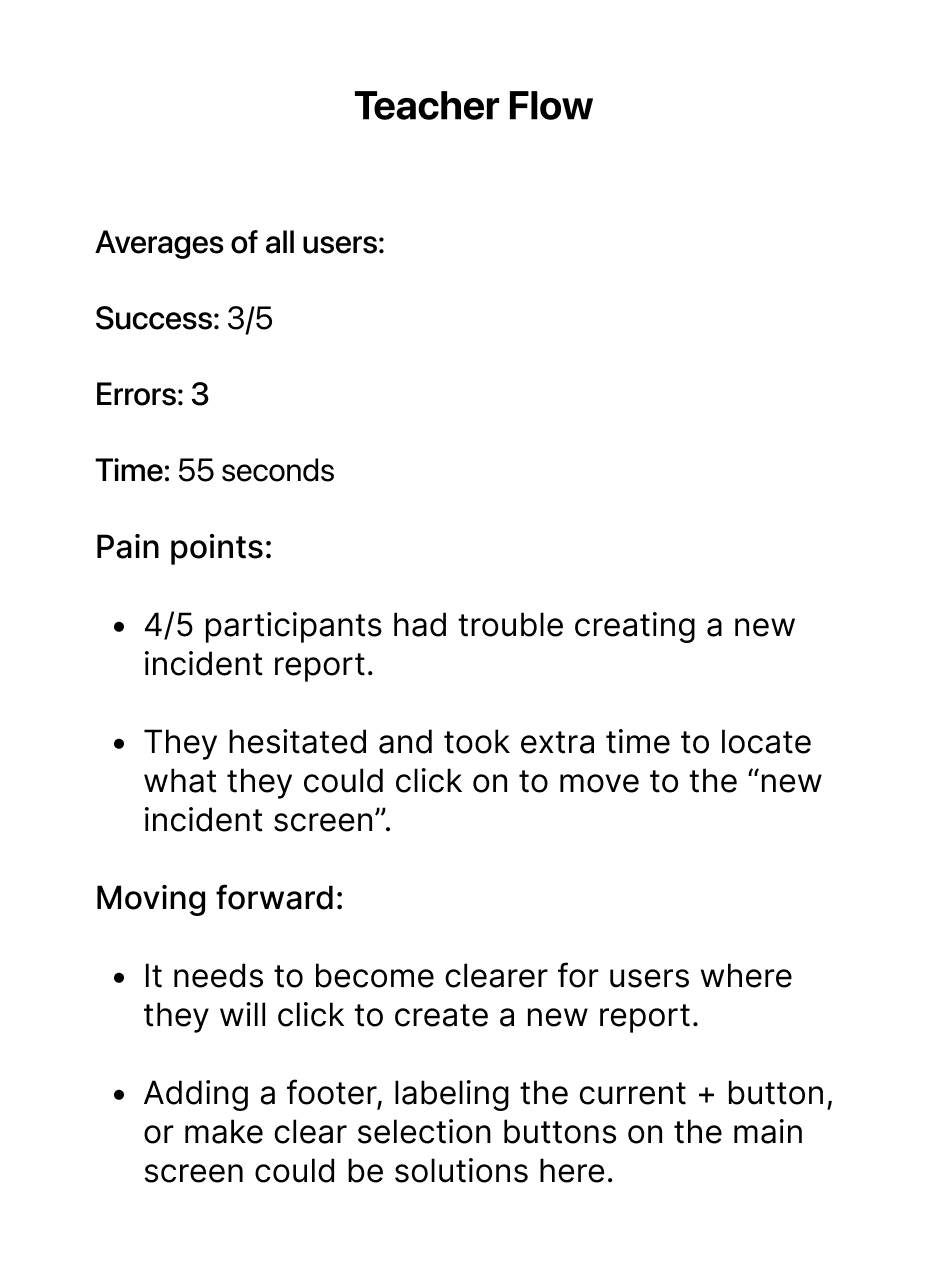
Teacher flow results.
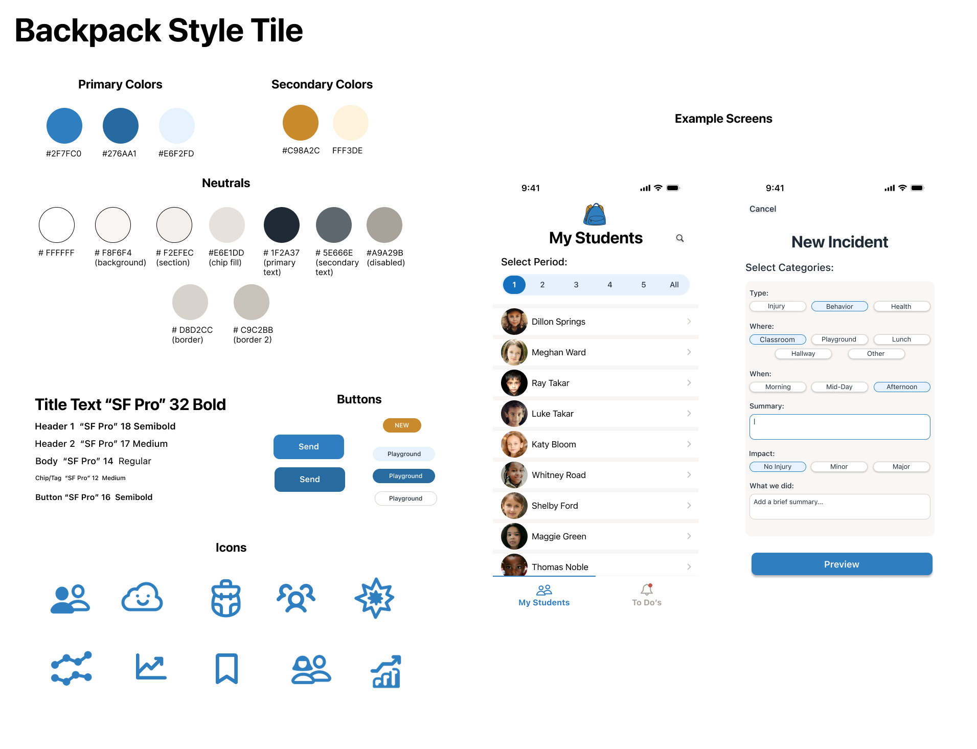
Style tile for Backpack.
Parent flow results.
During the develop phase, I created the style tile and logo designs. I wanted the interface to feel approachable, friendly, and trustworthy. I decided on blues and complementary yellows for the main color scheme. I chose a clear, user-friendly font, SF Pro, for all of the text.
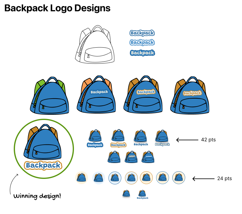
Backpack logo designs.
High-fidelity wireframes
I tested five participants on high-fidelity wireframes, using a Figma prototype. Participants were asked to complete two tasks:
Teacher flow: You are a teacher. Find a student and send an incident report to their parents.
Parent flow: You are a parent. Check on your child’s progress, and if you see a new report, schedule a follow-up call with the teacher.

High-fidelity teacher flow.
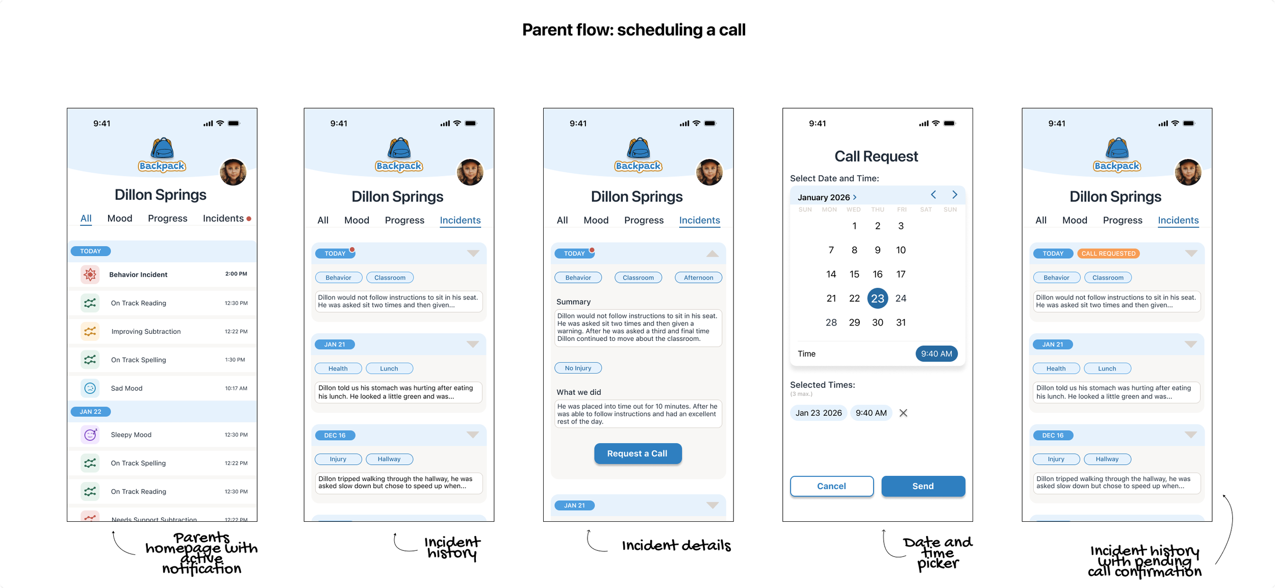
High-fidelity parent flow.
High-fidelity usability testing and results
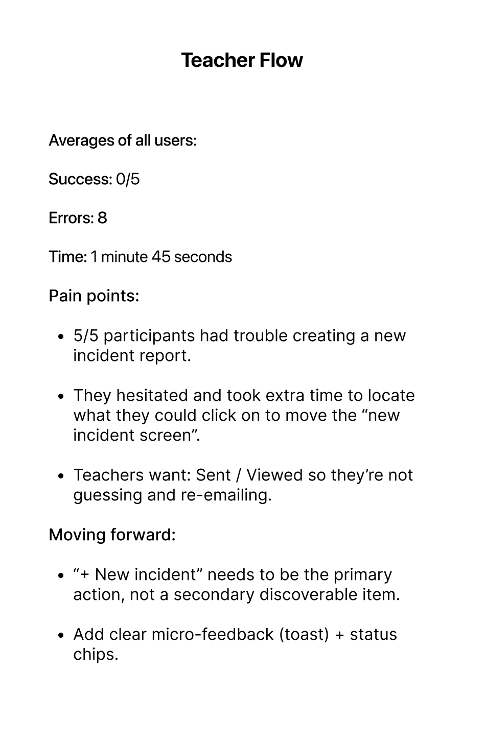
Teacher flow usability results.
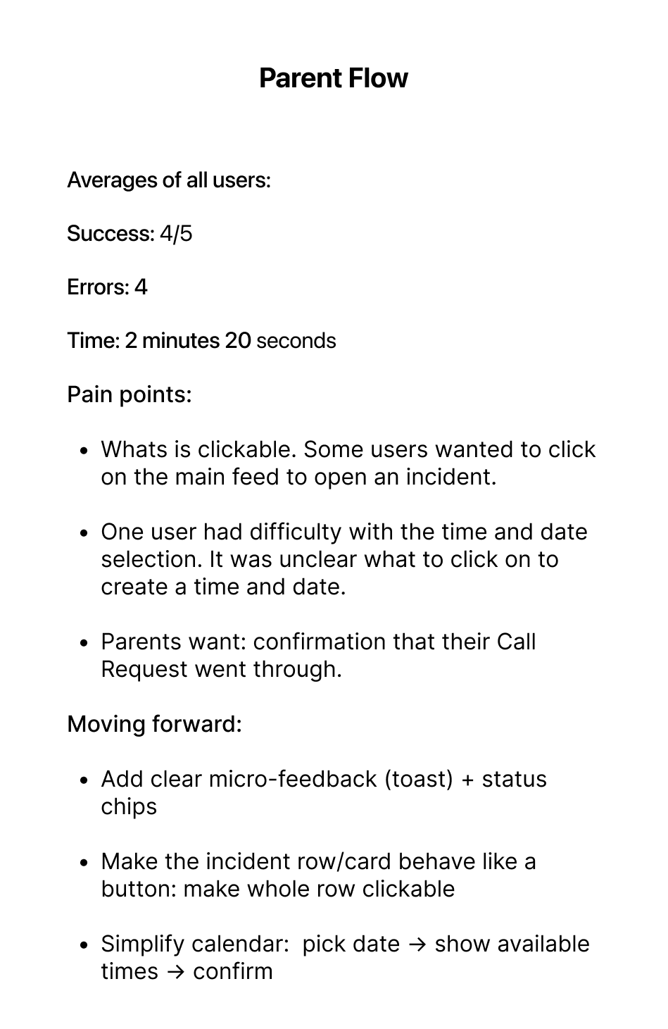
Parent flow usability results.
Deliver
Backpack in action!
Parent Flow
The parent opens the child’s dashboard and sees new updates. After reviewing them, the parent decides to schedule a call with the teacher. A confirmation screen then shows that the call has been scheduled.
Teacher Flow
Teacher selects student, chooses new incident, fills out the form, and sends to the student’s parent.
Final thoughts and takeaways
Backpack reinforced something I see constantly in UX:
People don’t need “more features,” they need less friction around what matters.
The biggest challenge was designing for two user types “teacher and parent” while keeping scope realistic.
Testing helped me focus on what to keep and what to simplify—especially around incident reporting, confirmation states, and interaction affordances.
What I learned
• Teachers need a clear “start” and a clear “done.”
• Parents scan first and click second—so hierarchy and tap cues matter more than extra content.
• Small UI feedback (sent/viewed states) can dramatically reduce back-and-forth.
If I had more time, I’d run another round of testing after revisions and explore a lightweight “acknowledged” parent reaction and school-wide alert banners (late start/ early release) as a future feature.
What I’m most proud of
Backpack stays focused: it’s a small MVP that solves one problem well—a calm, fast daily update that builds trust without creating more work.